Annual/lifetime allowance calculator
This project aimed to improve the usability and overall customer experience of the existing Lifetime & Annual Allowance Calculator.
Project role: UX Design Consultant
Project length: 6 months
Project overview
The original Fidelity International Lifetime & Annual Allowance Calculator was developed to help customers understand their remaining allowance—either for their lifetime or for the current tax year. However, analytics showed that many users found the tool confusing and difficult to use effectively. As a result, Fidelity International engaged CTC to redesign the calculators to create a more intuitive and user-friendly experience.
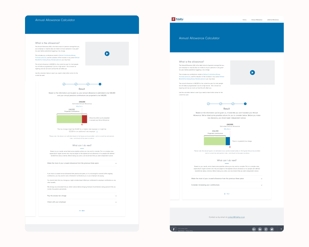
What is the Annual Allowance?
The annual allowance is the total amount that you, your employer, or anyone else can contribute to all of your pensions in a given tax year before potentially triggering an annual allowance charge.
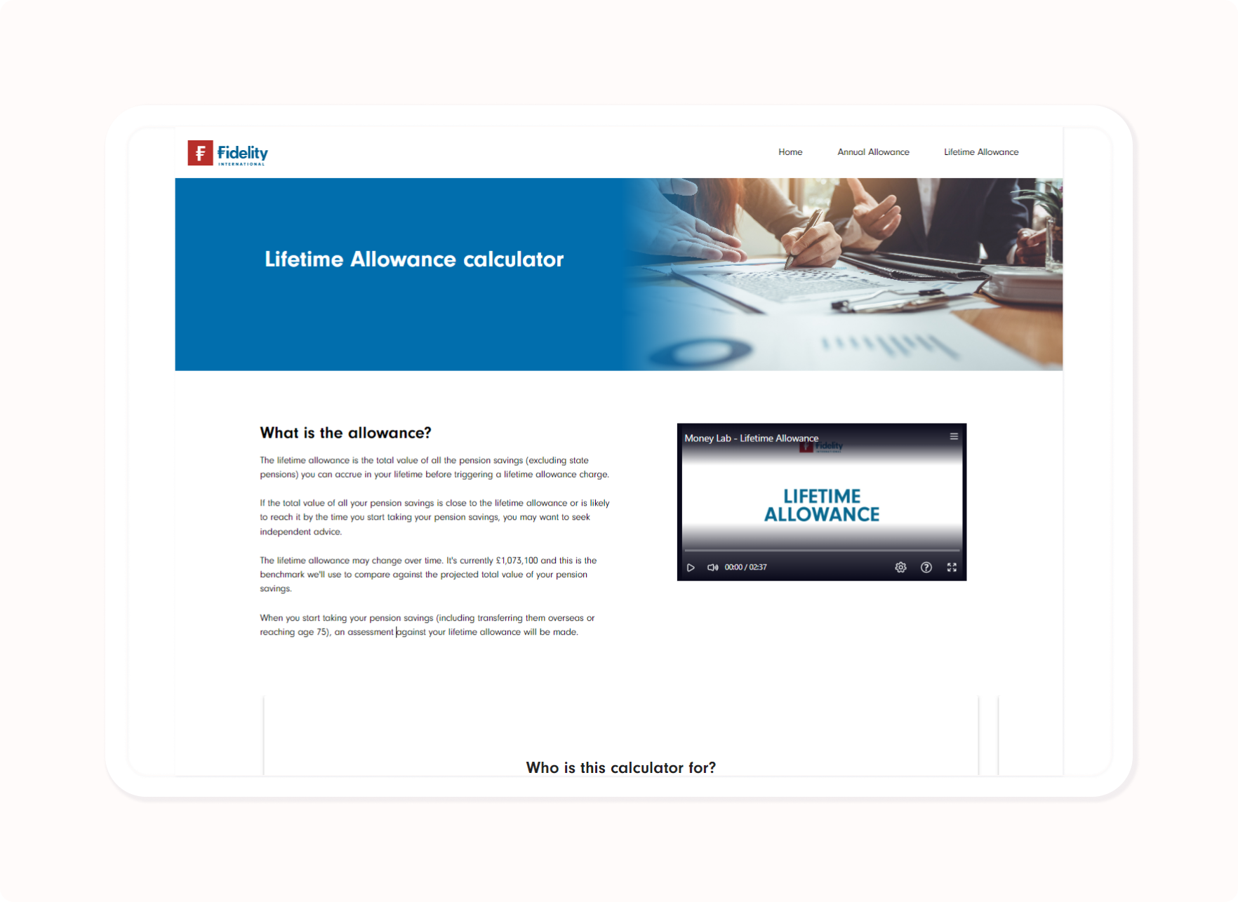
What is the Lifetime Allowance?
The lifetime allowance refers to the total value of all your pension savings (excluding the State Pension) that you can accumulate over your lifetime before incurring a lifetime allowance charge.
Existing design review
After gaining an initial understanding of the project background, a review of the current calculators revealed several issues:
Unclear site navigation, making it difficult for customers to know where to go or how to revisit relevant information during the calculation process.
Insufficient explanations, leaving users unsure about what actions they were taking or why.
An overly simplistic results screen, which failed to provide all the necessary information.
Inconsistent UX/UI styling, not aligned with the client's current design standards.
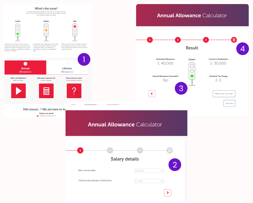
Initial redesign
The initial redesign of the calculators focused primarily on improving navigation. By consolidating the experience into a single screen—featuring the calculator as a built-in widget—users were able to seamlessly switch between the selected calculator and relevant help content. Early user testing indicated that this approach significantly enhanced the overall experience.
However, participants also expressed a desire for more detailed information within the results section. As a result, this became the primary area of focus for subsequent design iterations.
Results section focus
In the next iteration of the results section, additional data requested during previous user testing sessions was incorporated, along with extra helper text aimed at clarifying the meaning of the results.
However, these additions negatively impacted the usability of the section, largely due to the layout and the way the information was presented to users.
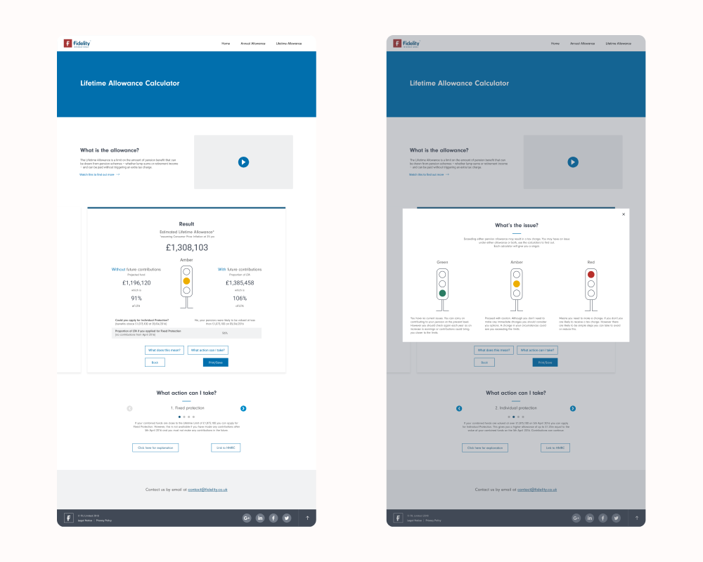
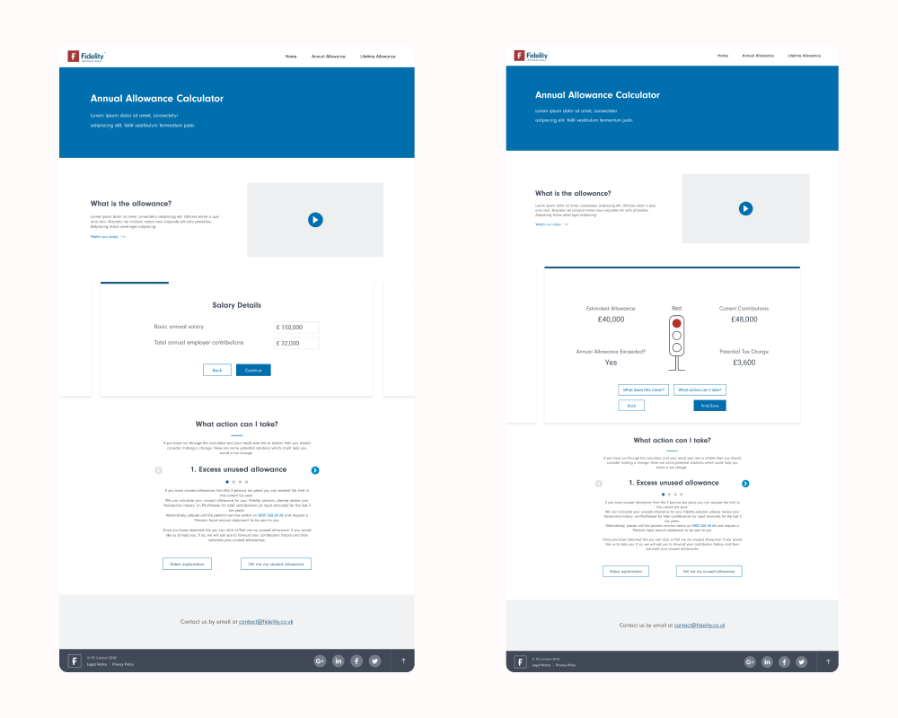
Results section iteration
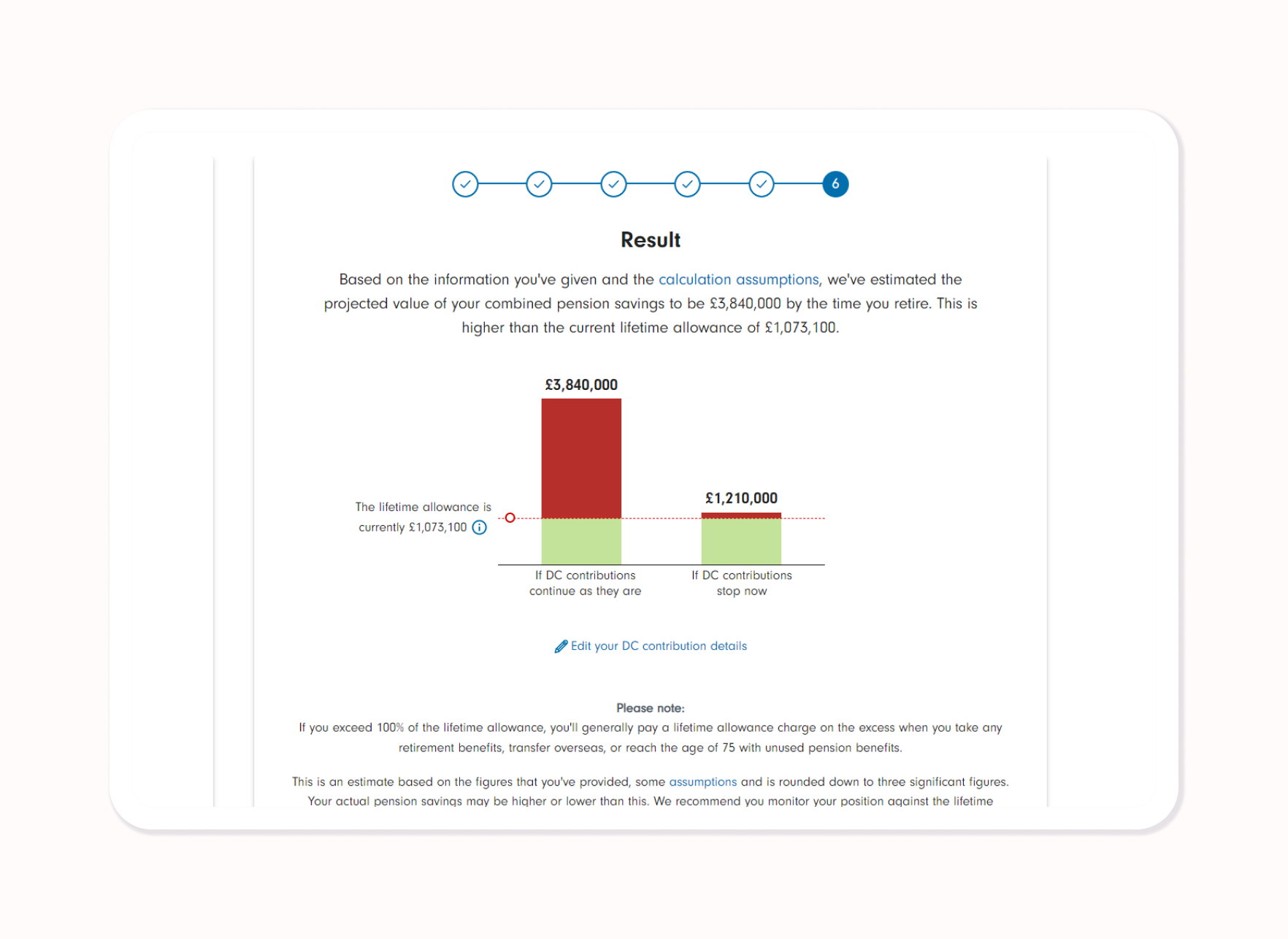
A complete overhaul of the results section was necessary to help customers better understand their financial situation in a way that was both clear and detailed. After exploring various concepts, a bar chart was introduced to visually indicate whether a customer was under or over their allowance, supported by contextual information to aid comprehension.
The redesign of the calculators was strongly guided by the WCAG AA accessibility standard, a core client requirement for all digital tools and websites. To ensure full compliance, I conducted ongoing accessibility testing—both from a user interface (UI) perspective and in collaboration with development teams.
Project outcome
The project resulted in a fully responsive, redesigned calculator experience that meets WCAG AA accessibility standards. Key improvements included:
A simplified navigation structure
Additional helper text across the customer journey
A clearer results screen that explains the customer’s financial position and provides actionable guidance, especially for those exceeding their allowance
Since the launch of the redesigned calculators for Fidelity International customers:
Customer queries related to the tool and its outputs have decreased
Fewer users are abandoning the journey mid-process
More customers are taking action based on their results, indicating improved understanding and engagement